
How to Choose the Perfect Paint Color for Your Home
When moving into a new home or refreshing your current space, choosing paint color can be a daunting task. Most paint supply stores have hundreds of colors. Light, flooring, and other factors can affect the appearance of your chosen paint color. In our guide we give you step-by-step instructions to picking the right color for your space.
Paint is such an easy change for a room and relatively inexpensive compared to some other interior design projects. However, it’s very easy to get wrong. That’s why careful selection is necessary to ensure you don’t end up with gallons of the wrong color.
Step #1: Understanding Light
Light can be a huge factor in how the paint looks in store. You think it’s perfect until you get home and start applying it to the walls and you realize it’s completely wrong.
Direction of Light:
Determining what direction your windows face is an important factor when it comes to color selection. What may have worked in one room, won’t work in another.
North: Northern light is cooler or dimmer in a room.
South: Southern light is warmer and brighter.
East: Eastern light creates a soft, white light.
West: Western light creates a warmer light.
Types of Light:
The harsh lights of the paint store are sometimes in sharp contrast to the lightbulbs in your home.
Incandescent: These bulbs are similar to warm sunlight and emit light that contains every color. Makes warm colors brighter and cool colors duller.
Fluorescent: These bulbs cast shadowless light that gives a blue tinge to the room. Newer fluorescent lighting makes colors appear to be their natural hues.
Halogen: These bulbs produce brighter, white light. Closest to natural light.
Tip: When selecting paint, it’s important to look at the paint in the daylight and in the evening to see it changes. Also, when choosing lightbulbs, be sure to read the box that tells you what type of light they emit.

Step #2: Understanding Color
Four Ways to Use Color:
Emotion: Color can set the emotional tone or ambiance of a space.
Attention: Color can help to focus or divert attention.
Size: Color can cause a space to feel smaller or larger.
Define: Color can help break up, define, or unify a space.
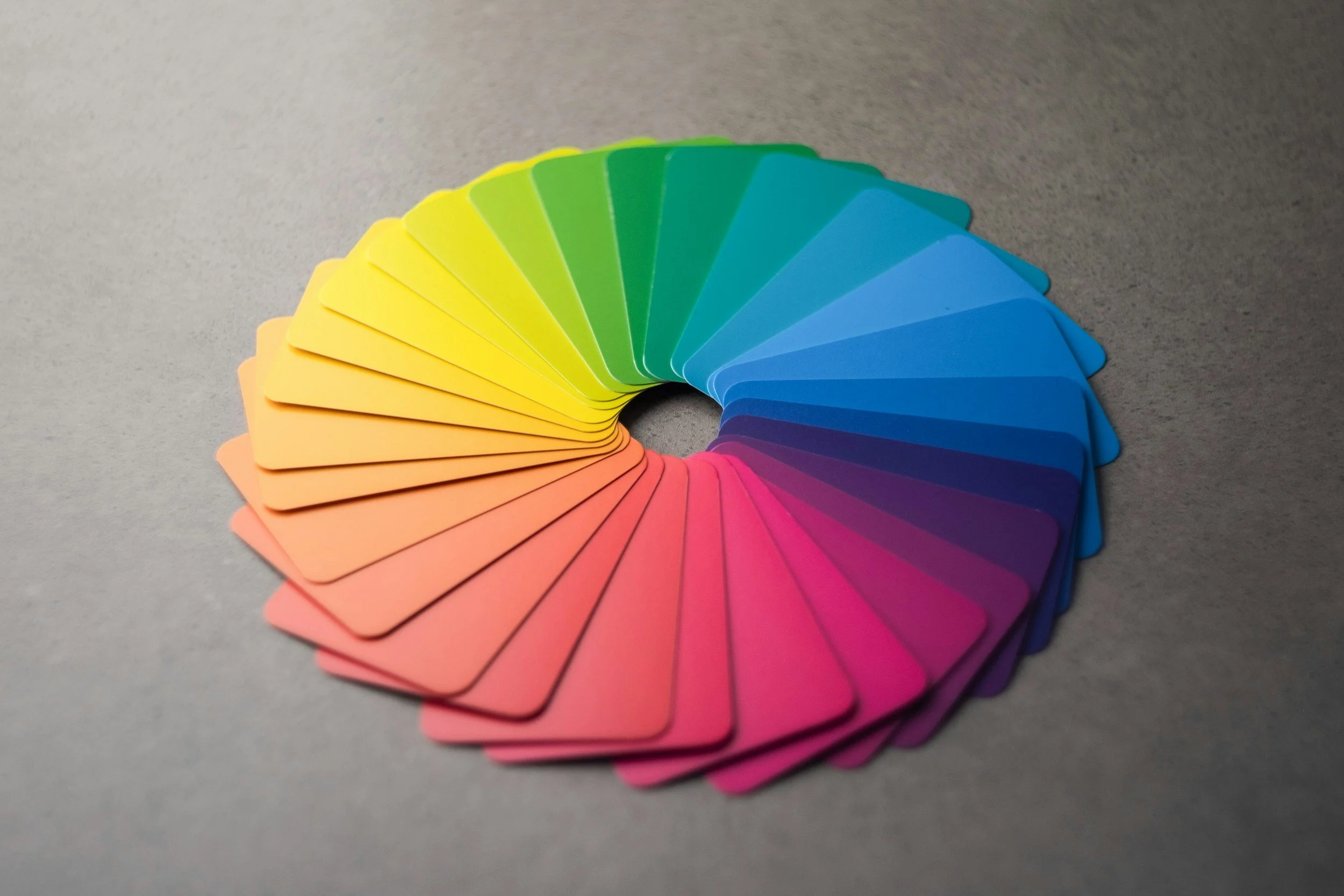
Color Scheme:
Monochromatic: Use a single color with a neutral.
Monotone: A single neutral color like beige, cream, or gray.
Complementary: Includes colors across from each other on the color wheel.
Analogous: Consists of colors that lie side by side on the color wheel.
Tip: When you have very little natural light, use dark colors and add lots of lighting. Add lighting such as ceiling lights, floor lamps, wall scones, LED strips, and table lamps.
Step #3: Gather Inspiration
Ways to Get Started:
Online search: Search for spaces you connect with. What is in that space that makes you love it? When searching, start general and then become more specific. For example, search for living room decor, then search based on a specific item. Do you own a blue couch? Look on Pinterest for living rooms with blue couches.
Personal items: Draw inspiration from artwork, a pillow, a rug, or a swatch of fabric you love.
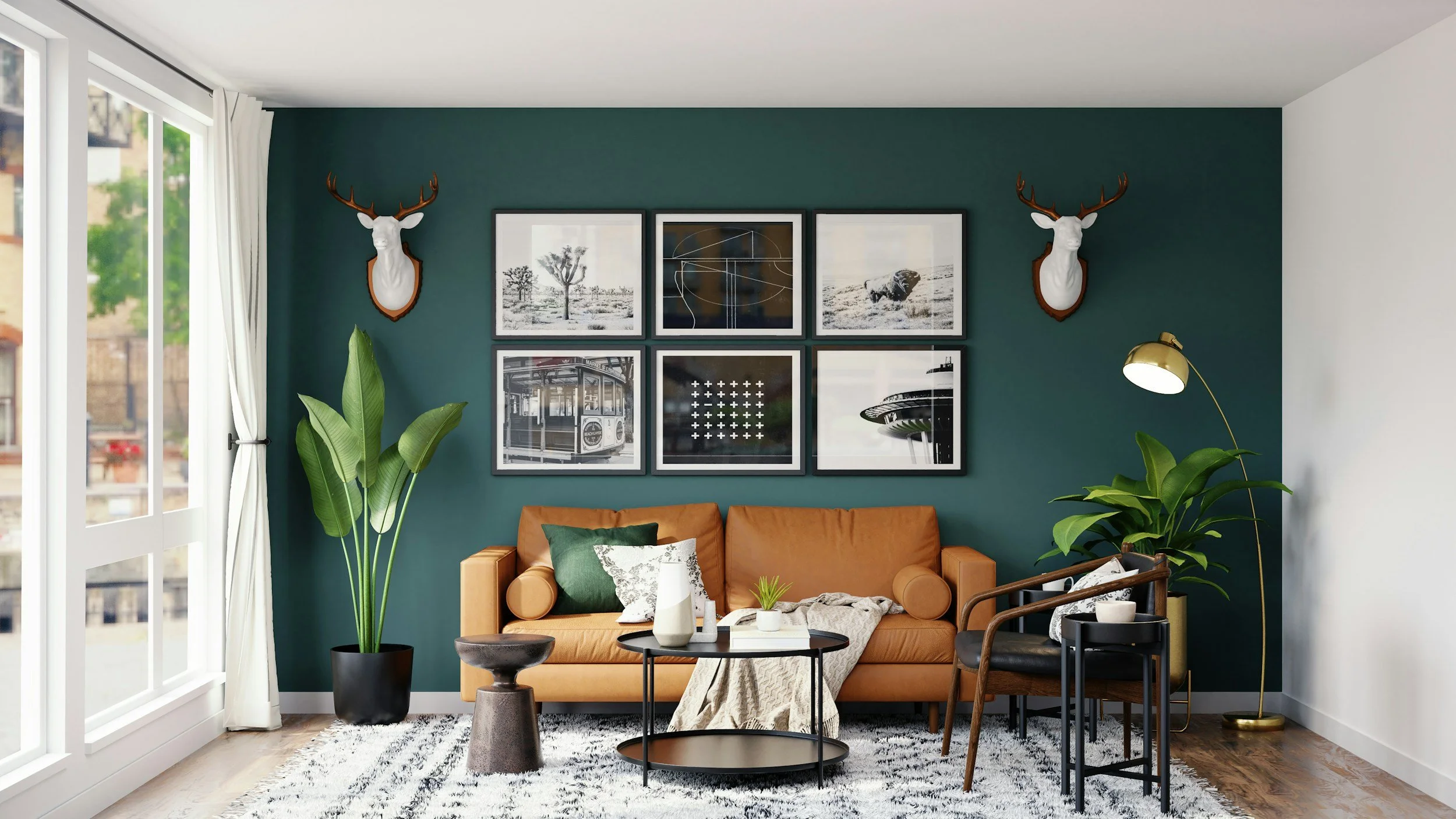
Color selection: Pull colors from the largest pattern or inspirational art piece in your space. If the colors work together in an inspiration piece, then they will work together in a room. Purchasing pieces first is much easier than painting walls first.
Tip: If you’re starting from scratch, start by searching based on your favorite color. Chances are, you will find design pieces you love, and it will jump-start your design.

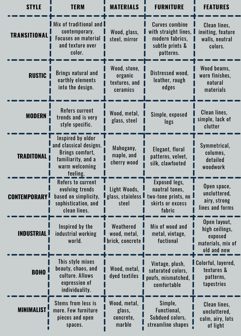
Step #4: Find Your Design Style
We created this chart which shows some of the most popular interior design trends. This is by no means an exhaustive list.
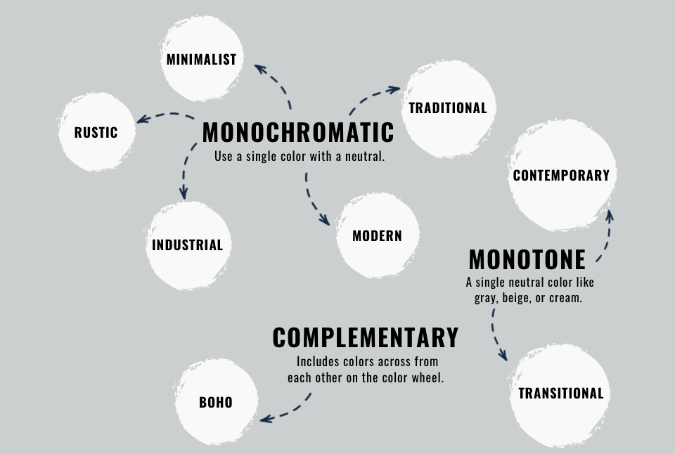
Step #5: Match Your Design Style with a Color Scheme
This graph breaks down which color schemes are the most suitable for certain design styles.
Step #6: Pick Some Colors!
Now that the pre-work is done, it’s time to choose your paints. By the time you reach this step, you can say you understand lighting in your space and the function of color. You have gathered inspiration, selected your design style, and matched it with a color scheme.

Step #7: Start with White
Categories of Color:
White: Includes pure white, off-white, cream, and tinted white.
Neutrals: Includes beige, taupe, and gray.
Color: Begins with the primary colors: blue, red, and green.
Choose The Right Base Color:
Off-white or cream: Select for earth tones like browns and tans.
Creams: Look best with muted earth tones.
Pure and off-white: This looks best with white colors.
Off-white or blue-white: Looks best with marble.
Tip: If you’re painting your walls pure white, make sure you have tons of natural light and large white furniture. The whiter, the better! Add lots of textures and layers. This is a great option if you have an amazing view to show off.
Step #8: Color Selection
Three Uses of Color:
Main color: Covers the main portion of the room, e.g., the walls.
Secondary color: Composes medium-sized objects like window treatments and furnishings.
Accent colors: Created by smaller objects such as artwork, pillows, and accessories.
Things to Consider:
Use of Space: Think about what and who the room is used for. For example, you can relate some rooms to the age of the inhabitants. Soft pastels keep an infant’s environment calm.
Size of the room: Crisp whites can make a space feel large and open. Warm colors can create a sense of intimacy. Small spaces can be made cozy by using darker colors, like in a study or foyer.
Beware of undertones! Look at your selections next to a solid hue in the same color family to help you see the undertones. Start by looking at it next to a pure white.
Step #9: Test Your Selections
Before you start applying the paint to your walls, you need to test them first.
Purchase supplies: Purchase samples of your top color selections and several sheets of
white poster board from a local craft store.
Paint Samples: Paint two coats of your sample paint on the poster board. Then cut the poster board into 4 pieces and hang one on each wall of the room. Watch throughout the day to see what it looks like in different lighting.
Color Finishes: Satin or eggshell is often used for walls because it is easy to clean and helps to hide imperfections. Semi or High-gloss finishes are great for trim.
Tip: Don’t be afraid to make a selection. If you are having a hard time selecting a color then ask someone what they think or just go with your gut. Worst-case scenario, you can always repaint.
A Few Mistakes to Avoid:
Mistake #1: Not Looking at Paint Colors Separately
Viewing your chosen colors swatches together can feel like the natural thing to do, but in reality you need to look at them separately and preferably against a pure white. You can do this by applying two coats of your selected color on poster board and observing it throughout the day, moving it to different areas to see how the light shines on it.
Mistake #2: Ignoring the Undertone of your Floor
This is a tricky one. Trying to determine your floor’s undertone can be a headache, but you don’t want to end up using a cool-toned paint when you have warm floors. Examine clean floors in natural daylight and drop a white piece of paper on the floor. Warm undertones will show hints of red, yellow, or orange. Cool undertones will appear gray or blue. Determining the undertone of your paint is much easier because many companies, such as Sherwin-Williams and Valspar, tell you the undertone of the paint.
Mistake #3: Not Waiting for Samples to Dry
Once you’ve painted your poster board, it’s important to let it dry completely. Wet and dry paint can look completely different in a room.
Mistake #4: Not Considering the Rest of the House
When choosing your color, consider the color scheme you want for the entire house. Clashing colors can be jarring.
Final Thoughts
Choosing the perfect paint color may feel overwhelming at first, but with the right process it becomes much easier—and even fun. By understanding how light affects color, gathering inspiration, testing your selections, and considering undertones, you’ll feel confident that the shade you choose will enhance your home rather than frustrate you.
Remember, paint is one of the most affordable and impactful design changes you can make. A few gallons can completely transform a room’s mood, size perception, and style. Take your time, trust your instincts, and don’t be afraid to experiment—you can always repaint if needed.
If you still feel stuck, that’s where working with a designer comes in. At Simply Practical, we help homeowners, vacation rental owners, and even apartment dwellers navigate decisions like paint colors so the end result reflects their personality, lifestyle, and needs.
Ready to refresh your space? Let us help you choose the right colors and pull everything together so you can enjoy a home that feels cohesive, inviting, and uniquely yours.
Until Next Time,
Happy Design!
P.S. Want more design tips like this? Join our email list to be the first to know about new blog posts, receive exclusive advice, and access special discounts.